Orange - Planet O
Orange reached out to create a logo and advertisement for their open talks. An event Orange organises every year now for their employees.
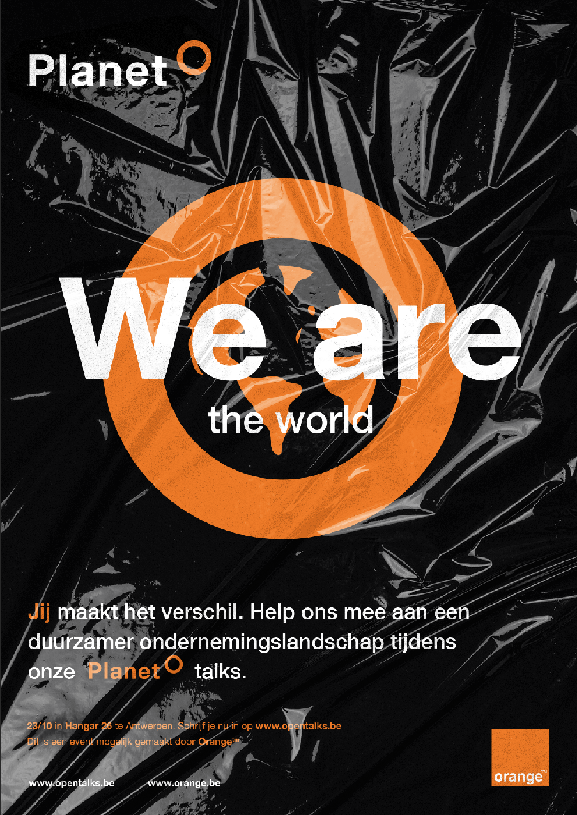
This year they named it “planet O”. An open talk event where employees fire out ideas to increase awareness about sustainability and social responsibility.

The very sleek environment in which Orange’s branding existed served as the foundation for Planet O’s logo.
The goal was to create recognizability by incorporating an abstract representation of our planet. By carefully maintaining consistent spacing, recurring line weights, and a logical elevation of the symbol, this logo came to life.
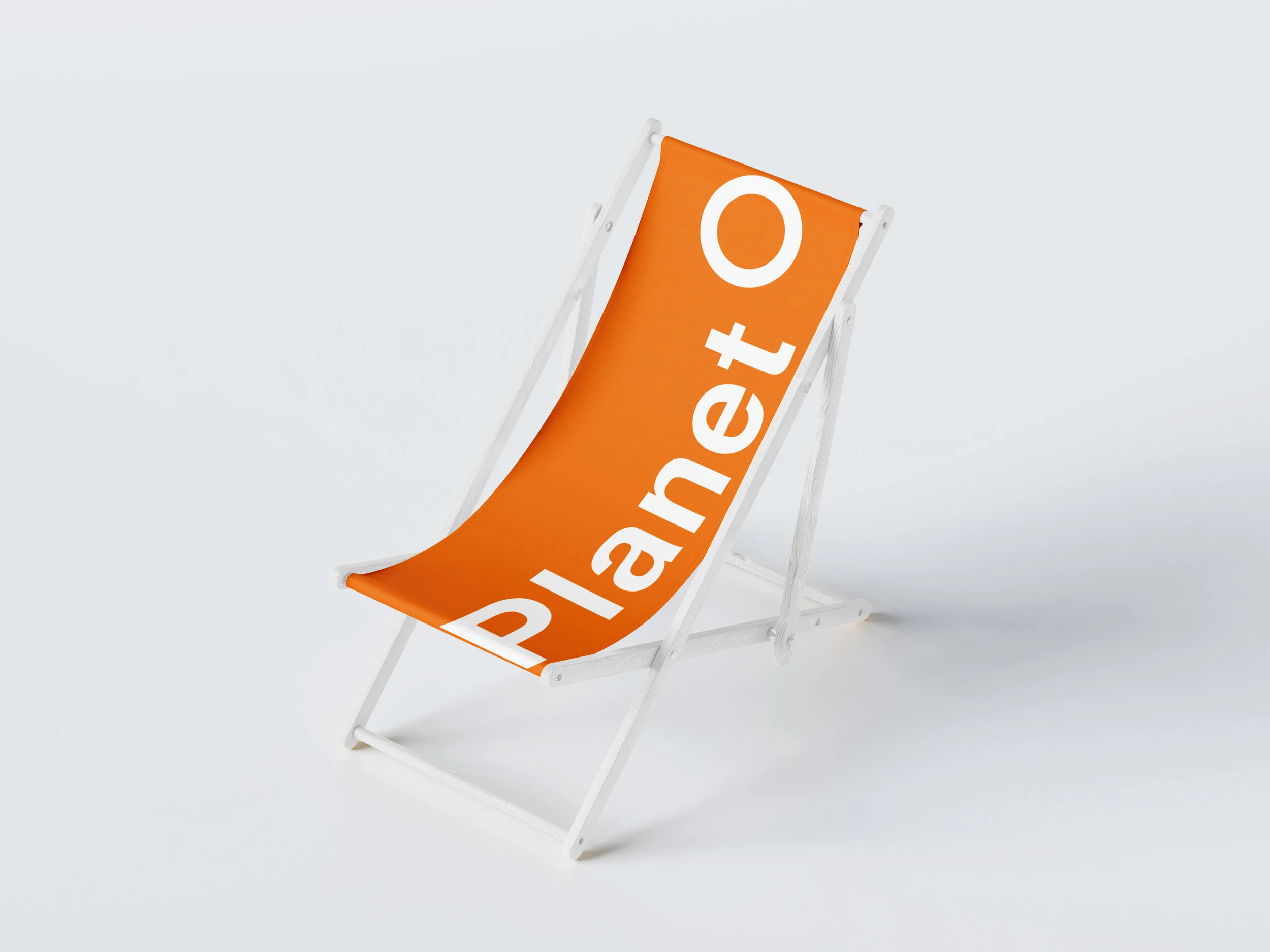
Planet O needed to be dynamic and easily applicable. To achieve this, only combinations from the standard Orange color palette were used.
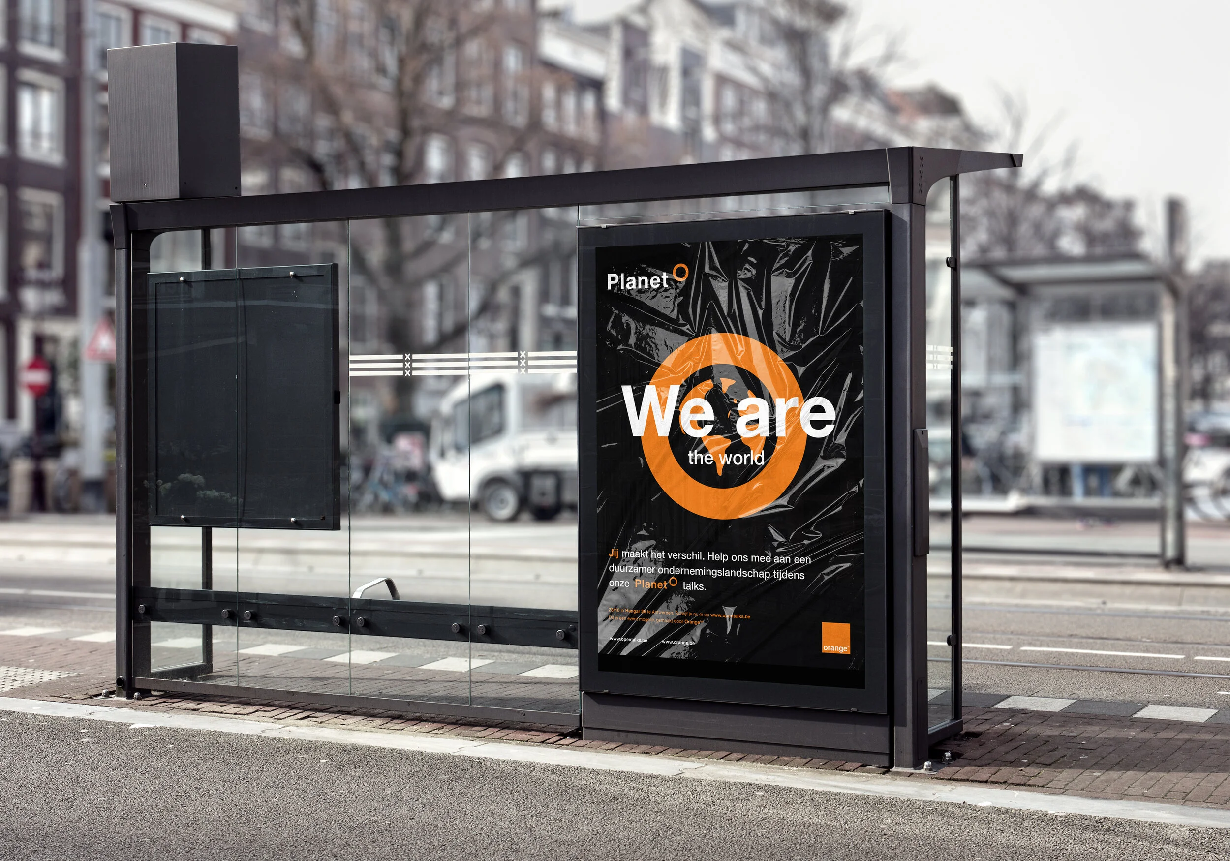
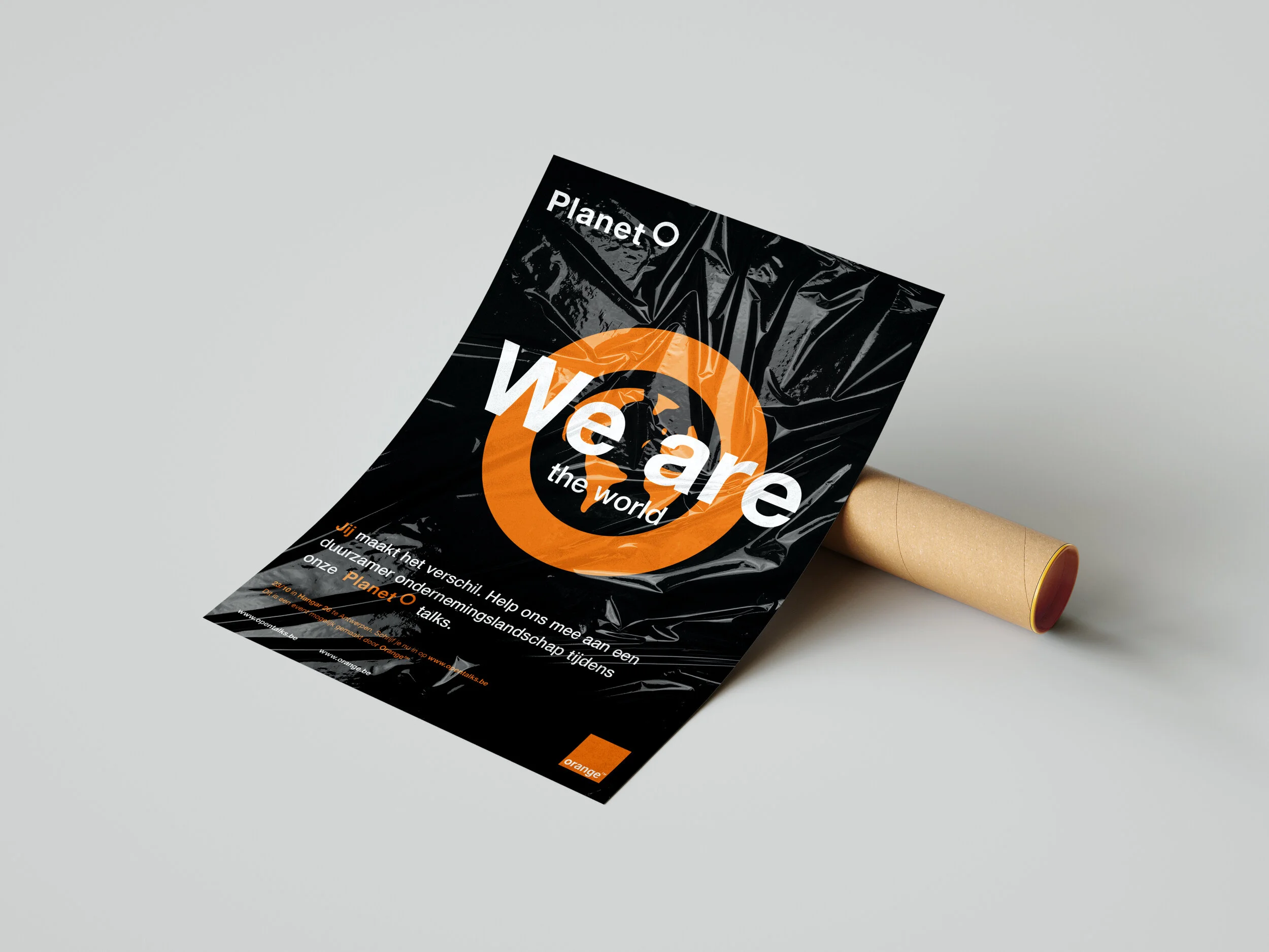
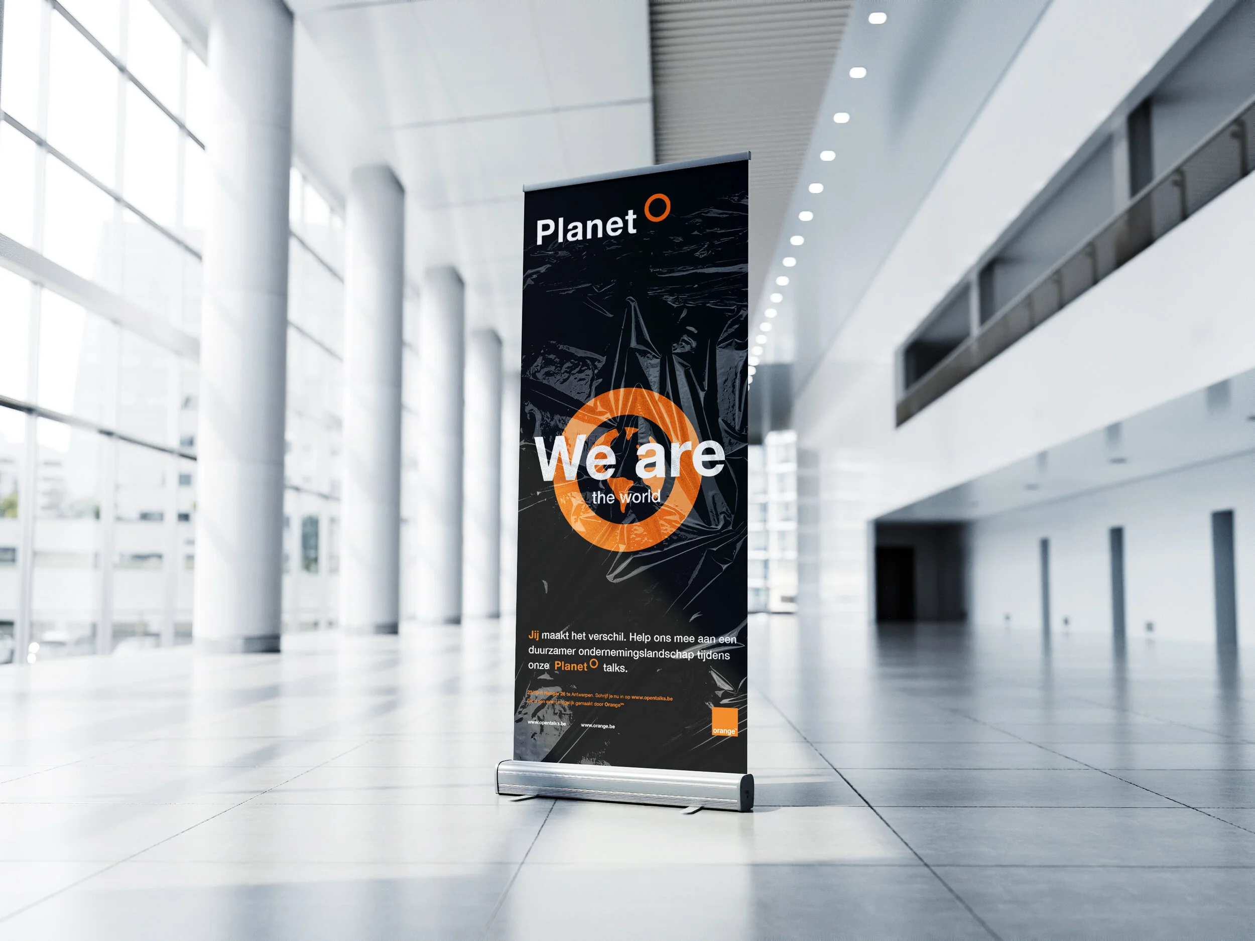
Furthermore, several applications featuring the logo are presented to illustrate how a further development within this visual style could unfold.


Advertisement design
The logo symbol was used as a recurring element — a protective circle surrounding the Earth. It has become increasingly clear that plastic is one of the planet’s greatest threats. As a brand, Orange is actively taking steps to reduce plastic waste in its packaging, although this goal has not yet been fully achieved.